Spin the Color Wheel
What colors work best together? Start by reviewing the principles of the standard color wheel, which organizes the color spectrum (representing the actual 16.7 million available color shades) into an easily usable format.
Once you know what you are looking for in color blends, you can review the PANTONE® color chart of a printer to see if it meets your business needs.

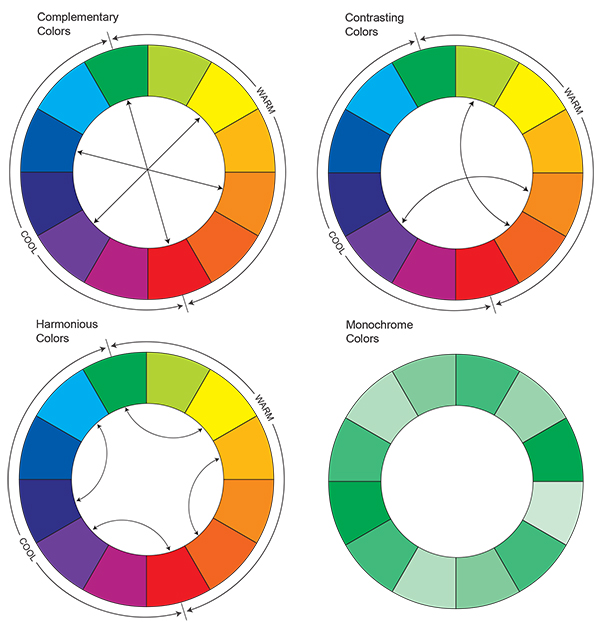
Essentially, the color wheel is divided into two halves, warm and cool shades. Warm colors, such as yellow and red, advance (or jump), which makes them effective for spotlighting items. Cool colors, such as violet and bluish green, recede (or fade) and are considered to be calm, which makes them a good choice for backgrounds. (Note that each color segment represents the entire range of shades within that hue. Green and red have both warm and cool shades within their hues.)
Complementary colors lie directly across from each other on the color wheel and tend to be lively, vibrant hues. Harmonious colors, also called analogous colors, are separated by one segment on the color wheel. Contrasting colors are separated by three segments on the color wheel.
When choosing the appropriate colors for your own palette, the trick is to let one color dominate and reserve its "partner" color for accents only. Using color combinations at full-saturation levels can have an overwhelming effect, so it's best to choose a tint or percentage of the true color, or tone down both colors.
Monochromatic colors, which are varying tints of a single hue (such as light green, true green, and dark green) allow you to broaden your choices within a single color selection.
Primary colors refer to red, blue and yellow and form a triangle with each other.
Secondary colors are located midway between the primary colors.
Once you've decided on your basic color scheme, zero in on specific colors from the industry's most recent color forecasts, from resources such as The Color Association of the United Status (CAUS), The Color Marketing Group, or PANTONE to ensure your choices are in line with upcoming color trends.
Xerox® Colour Products
Related Articles

How Partners Help a Distributed Workforce Strategy
Midmarket organisations face many challenges with distributed workforces. See how IT departments benefit from trusted partners to modernise remote and hybrid user support.

Create a more sustainable office
Discover how Xerox enables more responsible printing and sustainability strategies for businesses. Solutions, recycling, and more.

Training provider innovates the delivery of learning, making content more accessible.
CRC Formation training staff use Xerox® Workflow Central to offer students new ways to learn.

Bell Law Case Study
Discover how a leading employment law firm overcame document processing and sharing hurdles with the innovative solutions provided by Xerox® Workflow Central.

Make hybrid work, work
See some of Xerox's top tips for making hybrid work, work for both small and medium businesses.

3 Essentials to Cybersecurity
Discover how Xerox technologies can help to secure your printer and data.


